Release Analytics are designed to give a quick understanding of Release statistics summary. The Burn Up and Burn Down Charts help you analyze and track your work.
1. Access Release Analytics
There are multiple ways to access Release Analytics page.
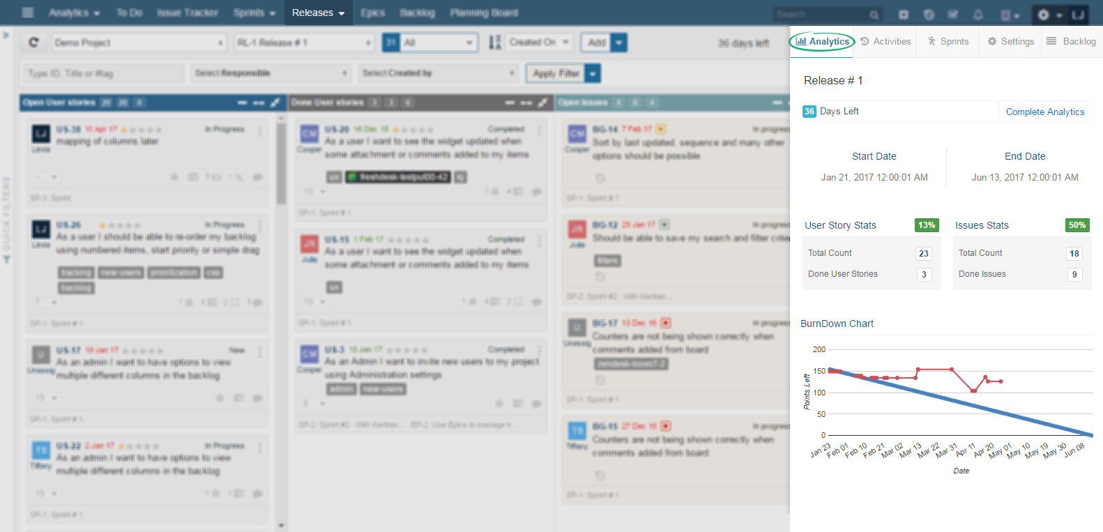
1.1 Quick Release Analytics
Quick Release Analytics can be accessed from Release Board and gives essential information of selected release. It includes Days left in Release, Summary of User Story and Issues stats, and BurnDown chart. If you want to get more details, click on Complete Analytics provided on the same page. To access Quick Release analytics:
1.2 Detailed Release Analysis
Detailed Release Analytics includes Statistics Cards, BurnUp, and BurnDown chart. You can define Release Goal here. It can be accessed by:
2. Release Analytics Overview
Release Analytics page provides you detailed reports of your Release. With all statistics in hand, you can evaluate and define your next steps to achieve your Release Goals. Let’s get you acquainted with the Release Analytics.
2.1 Project and Release
Complete Release Analytics shows statistics of the project release that you navigated from. If you want to view analytics of some other Release, just use the top left side drop down options under navigation menu and choose your desired Project and Release.
2.2 Statistics Cards
When dealing with large Releases, it becomes almost impossible to keep track of work done and work left. Yodiz Analytics view can help you comprehend the Release Stats in one quick view. Let’s discuss each of them individually.
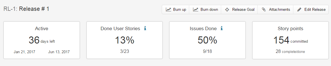 2.2.1 Active
It is basically the current Status of your Release and the number indicates remaining days in Release completion, along with the start and end date of Release on each side.
2.2.2 Done User StoriesPercentage of User Stories done in a Release. At the bottom of this card, you can find the number of done User Stories out of total User Stories.
Note: If any User Story is completed after the Release date, a small notification will appear on this card informing that the current stats are for the work done after Release end date.2.2.3 Issues Done
Percentage of Fixed Issues in a Release. At the bottom of this card, you can find the number of fixed Issues (belonging to done category) out of total Issues.
2.2.4 Story PointsIt shows the number of total story points committed for the Release in User Stories as well as the completed points.
Note: In case, you have selected hours as estimation method in your project settings, you will be shown hours statistics here, instead of Story Points.
3. Burnup Graph
This graph shows you the progress of Release. It is used to track how much work you have completed over a period of time. Work that has been completed can be considered as burned points.his way graph shows you the accumulated burned points over a period of time.
3.1 Interpreting The Burnup Graph
Release Burnup chart is used to know difference in work completed versus planned work of the Release. A smooth drop of red line along time, on the graph shows continuous progress of Done work items. Distance between two lines is the amount of work estimated to finish by that date. The Release work will be complete when both lines meet.
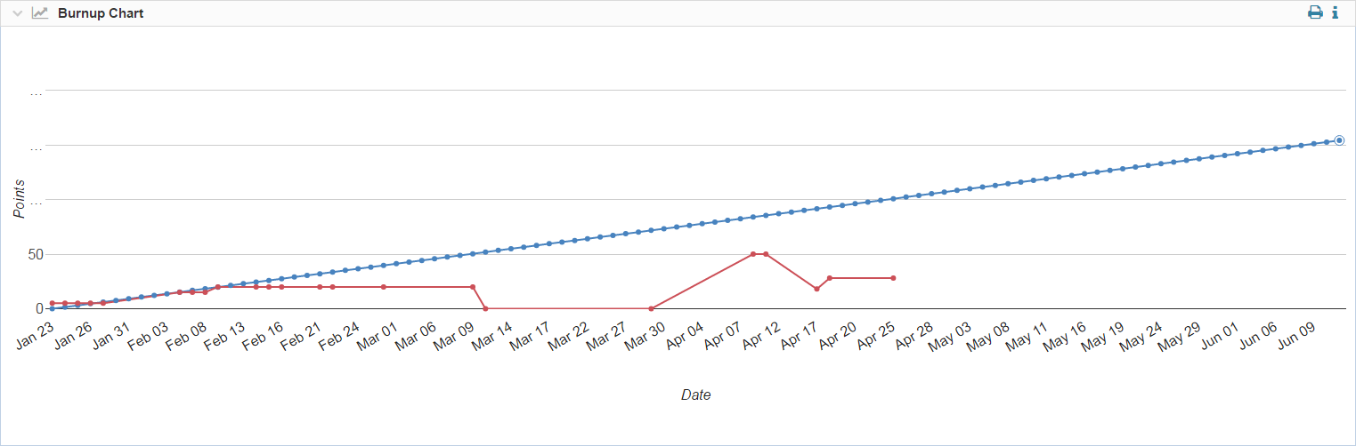
Note: The leftmost corner of graph shows the planned work at start date of Release. Rightmost side of graph is closing date of Release. All planned work is expected to finish by that date.
- X axis (Horizontal line at bottom) displays the working days.
- Y axis (vertical side) displays total Story Points or Hours (according to your project settings).
- Ideal effort as a guideline/projection is indicated by the blue line. This line shows the amount of work completed at a uniform rate and all planned tasks are finished by the end of Release
- Real progress of effort is indicated by the Red Line. It shows the the sum of “Effort Remaining”.
- Each dotted point on the line, is the sum of the work “TO BE COMPETED” on that date.
4. Burndown Graph
This graph shows you the progress of Releases over a period of time. The graph tracks how much work is left to be done. Work that has to be completed is considered as points, therefore it shows you how many points need to be burned.
4.1 Interpreting the Burndown Graph
Release Burndown chart is used to know difference in work left versus planned work of the Release. A smooth drop of red line along time, on the graph shows continuous progress of Done work items. Release work will complete when both lines meet.
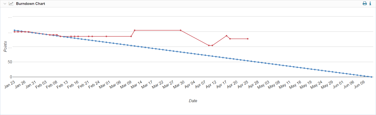
Note: The leftmost corner of graph shows the planned work at start date of Release. Rightmost side of graph is closing date of Release. All planned work is expected to finish by that date.
- X axis (Horizontal line at bottom) displays the working days.
- Y axis (vertical side) displays total Story Points or Hours (according to your project settings).
- Ideal effort as a guideline/projection is indicated by the blue line. This line shows the amount of work completed at a uniform rate and all planned tasks are finished by the end of Release
- Real progress of effort is indicated by the Red Line. It shows the the sum of “Effort Remaining”.
- Each dotted point on the Blue line, is the sum of the work “TO BE COMPETED” on that date.
5. Release Goal
It is the editable field where you can add a list of goals to be achieved by the end of Release.
6. Attachments
Reference documents for the Releases are added as attachments which can be viewed in the Release Analytics too.
7. Edit Release
To make changes in the Release information For example, Release Name, Description or Dependencies, click on the top right Edit Release button.