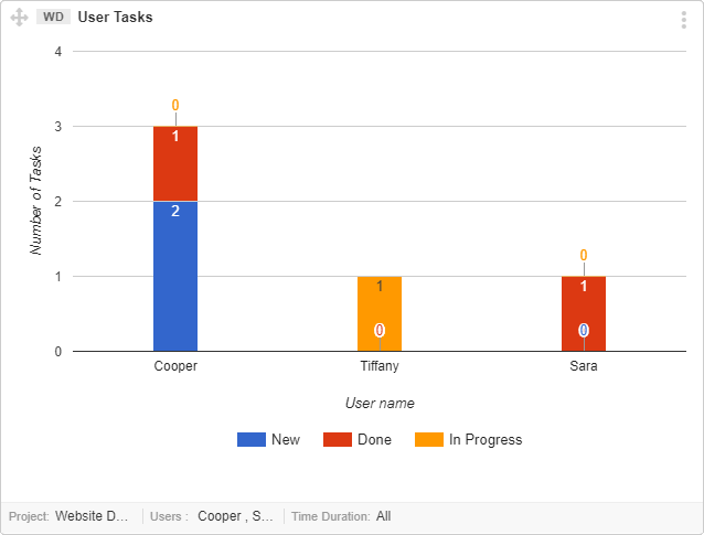
This graph gives you a way to learn about your team members workload in a project. By observing the graph, you can also analyze the status of the Tasks (new, in progress or done) for each user. This graph is helpful if you are interested to know the total number of Task assigned to the user(s) in a project life cycle and current status of each task.
Interpret this Graph
Follow the points below, in order to understand the interpretation of this graph.
- The Y axis indicates number of Tasks.
- The X axis is for user names.
- The colors indicate basic status set of Item statuses (New, In Progress, Done).
- The number of bars represent Task count in individual status per User.
Note:
you can set limit to fetch data for “30 Days” or “All Time”.
All your project members data can be filled in to graph, there’s no limit.